


Why isn't my div centered? Why does it overflow? Why do I always have to override a lot of rules to make CSS less unpredictable?
Yes, I know how it feels, CSS sometimes doesn't make any sense at all. And one of the reasons is that it has accumulated many, many design mistakes throughout its history.
Today we will take a look at one of many, one of a long list, today we will cover the case of border-radius.
The Incomplete List of Mistakes in the Design of CSS
The group of people in charge of maintaining the CSS spec is called CSSWG (CSS Working Group). The interesting part is that they (yes, they themselves) have an article on their website listing the different design mistakes they acknowledge to have committed in CSS over the years.
One example of these errors is the case of the box-sizing property, whose default value should have been border-box instead of container-box. Something that I'm sure you have had to overwrite hundreds of times.
If we explore the list we will see a lot of interesting examples. And our protagonist of today is one of those curious and even comical cases: the border-radius property, which should have been called corner-radius instead. Below we will understand why.
Understanding border-radius.
Let's begin with a simple example:
<div class="square"></div>
<div class="square with-border-radius"></div>
/* ... styles to center the divs, dark background, etc ... */

.square {
  width: 200px;
  height: 200px;
  background-color: mediumpurple;
}

.with-border-radius {
  border-radius: 200px;
}
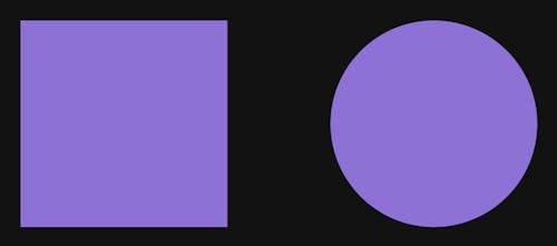
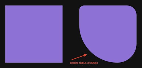
So far, nothing too unusual. Perhaps the most interesting part is that we have applied a border-radius equal to the width of the square (200px). This is unusual. If we want to create a circle, we usually do border-radius: 50% instead, right? But what happens if we use 100%, or if we use the specific width of our element, or maybe even more than that? Well, this is one of the key concepts to understand border-radius.
When we have a square, the maximum value that the border-radius property accepts is always half of its width. If we put more than this amount, CSS will ignore it and take the maximum value, that is, width/2 as we have said. On the other hand, the minimum value is 0. If we pass a smaller number, negative in this case, CSS will ignore it and assume 0, which is the same as if we were not applying any border-radius at all.
But why does this behavior occur and what exactly does CSS do with the border-radius value? Well, the key is in its name: radius. CSS uses the border-radius value to build a circle with that radius. And then it uses it to round the corners of our element. This sounds complicated but you will see that it is very simple to understand visually.
In our example from earlier, we had a square with a width: 200px and a border-radius: 200px. However, as we have seen, the maximum value for border-radius in this case is half the width of the square, so in reality, CSS will assume a value equivalent to border-radius: 100px. Therefore, we would have a case identical to the following:
<div class="square"></div>
<div class="square with-border-radius"></div>
.square {
  width: 200px;
  height: 200px;
  background-color: mediumpurple;
}

.with-border-radius {
  border-radius: 100px;
}
As you would expect, the result is the same as before. But that's not what's interesting. Let's now see how CSS goes from the square (left) to the circle (right):
First, let's visualize the radius=100px circle:
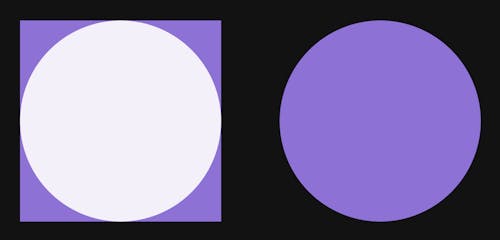
Now the idea of rounding is very clear, CSS simply follows the curve of the circle to round the corner (and not the border) of our element.
Here we also see the idea behind the maximum and minimum values of border-radius. If we use a negative value or 0, then we have no circle to round the corners. On the other hand, the largest circle we can create to round all corners of a square is just the one with radius=width/2, because it is the largest one that "fits" inside. Or, in other words, there is no larger circle that allows us to round the 4 corners and have the same curvature in all of them.
More examples of corner-radius border-radius
Another reason to claim that border-radius should have been called corner-radius is that there are CSS properties that allow us to target specific corners to round. Let's see an example:
<div class="square"></div>
<div class="square with-a-corner-radius"></div>
.square {
  width: 200px;
  height: 200px;
  background-color: mediumpurple;
}

.with-a-corner-radius {
  border-top-left-radius: 50px;
}
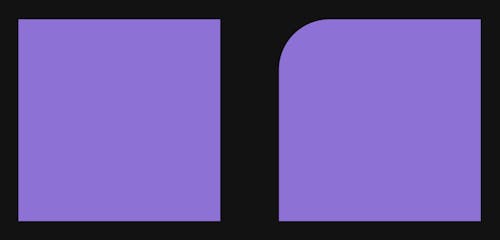
The border-top-left-radius property allows us to round that specific corner, following the same idea we explained before.
Since the border-radius is 50px, which is less than the width of the square (or even less than its half), we don't have to worry about maximums or minimums. In short, CSS will use a radius=50px circle to round the corner:

As you might imagine, there are also CSS properties that allow us to apply a border-radius to the rest of the corners (border-top-right-radius, border-bottom-right-radius and border-bottom-left-radius).
On the other hand, the border-radius property itself can also accept multiple values:
.with-a-corner-radius {
  border-top-left-radius: 50px;
}

/* vs */

.with-a-corner-radius2 {
  border-radius: 50px 0 0 0;
}
When we pass four values to border-radius, CSS applies them clockwise starting from the top left corner. And there is also the possibility to pass three or two values. It is interesting to check the documentation to discover all the possibilities.
In any case, this syntax is useful to see intuitively that the higher the border-radius, the more pronounced the curvature of the corner:
<div class="square"></div>
<div class="square with-clock-border-radius"></div>
.square {
  width: 200px;
  height: 200px;
  background-color: mediumpurple;
}

.with-clock-border-radius {
  border-radius: 25px 50px 100px 200px;
}

If we go from the upper left corner, clockwise, the border-radius applied increases and, with it, the curvature is also more pronounced. This makes sense, because the larger the border-radius the larger the circle to be used to round the corner in particular will be.
Apart from this, we can also see something curious when we use border-radius with multiple values, the logic of minimum and maximum seems to change. In this case we have a square with width=200px, which means that the maximum border-radius should be 100px (its half). However, in the last corner we are applying more than that and it seems to be working, its curve is more pronounced:
The reality is that when we use multiple values for border-radius the maximum value constraints change a bit. But this is a discussion for another more in-depth article 😉.
Something that is also a topic for another day is the idea that CSS supports rounding with ellipses. In other words, it is possible to indicate as border-radius two radius values for the circle. To be more precise, we would be constructing an ellipse, instead of a circle, to round the corners. However, doing this is quite out of the ordinary and perhaps also deserves its own article.
Conclusion
What would we do without CSS? Even with all its inconsistencies, it's what gives style to the web 😁.
Today we learned a bit more about one of its most used properties, border-radius and saw why it should have been called corner-radius in the first place. Why? Simply because it applies to corners and not borders.
There are a lot of other interesting cases in the list of design errors from the CSS Working Group. I invite you to discover them and continue learning the curiosities and intricacies of CSS.