


We recently wanted to use tailwindcss to help developers at one of our customers create maintainable and scalable styling. At the same time we were creating web components for a design system. This raises one big issue with tailwind since we were going to use ShadowDOM. This will prevent globally available tailwind utility classes to be available in our components. But with LitElement we found a good way to get the best of both worlds without having to disable ShadowDOM!
The source code referenced in this post can be found on GitHub.
The problem with ShadowDOM
One of the basic promises of web components is the boundary that prevents styles from the outside leaking into the component. This is achieved with the introduction of the ShadowDOM, you can read more about it on MDN. This way we can write web components that look the exact same way wherever they are used. The downside of this is our own global styles will also have no option to "pierce" through the ShadowDOM.
There is options to allow specific elements in our web components to receive styling from the outside like ::part but this does not work for general styles that should be assignable on every element we want. So we need to come up with a way to have tailwind utility classes in each of our components without having to copy them. Let's get started!
Setup
First off we want to have an easy and fast setup. We found lit and vite to be a great combination, so I'm going to start with the vite template found in their guides:
npm create vite@latest lit-tailwind-integration --template lit-ts
This will set up a basic lit app with vite as our bundler and dev server. Next we need the setup for tailwind. I'll just install it like tailwind recommends in their docs:
npm install -D tailwindcss postcss autoprefixer
npx tailwindcss init -p
Before we look at the configuration lets have a look at what we got so far. We start with one
component my-element.ts that has component-specific styling in the static styles property. Next
to this we also have an index.css providing global styles for our page. All of these files get
loaded in the index.html and that is already everything for our app. The rest is configuration and
assets.
Importing tailwind
To make tailwind include its classes we need to import their directives somewhere. If we just import
them in the index.css the ShadowDOM will protect our component from getting the styles. So we need
to find another solution. Earlier I mentioned the static styles property giving us
component-specific styles. This property can be leveraged to contain an array of styles.
See lit documentation. Let's try this out with
a global.css that we can import and pass to lit. This way lit can take care of linking it properly
and making sure it is not duplicated for each component.
/* global.css */
@tailwind base;
@tailwind components;
@tailwind utilities;
To import this css we will use a vite-specific import flag, but importing css can be solved in any bundler with ease.
import globalStyles from './global.css?inline';
Like this, we will get the whole CSS as a plain string in the variable globalStyles. Now to add
them to the array of styles we need this CSS to be a CSSResult. Thankfully lit provides a method
to parse CSS as plain string called unsafeCSS. Since we load our own CSS file and do not import
or evaluate any user input here, we are safe.
@customElement('my-element')
export class MyElement extends LitElement {
  static styles = [
    unsafeCSS(globalStyles),
    css`[existing component styles]`,
  ]
}
To finish it off we need to tell tailwind which files will contain tailwindcss classes. We do this
in tailwind.config.cjs by extending the content array:
module.exports = {
  content: [
    './src/**/*.ts',
  ],
  theme: {
    extend: {},
  },
  plugins: [],
}
Testing it out
To properly test it we need to use some tailwind classes. Let's just add some to one of our containers inside the component:
<div class="flex justify-around bg-white rounded-xl shadow-xl shadow-indigo-500/40">
    <a href="https://vitejs.dev" target="_blank">
        <img src="/vite.svg" class="logo" alt="Vite logo"/>
    </a>
    <a href="https://lit.dev" target="_blank">
        <img src=${litLogo} class="logo lit" alt="Lit logo"/>
    </a>
</div>
<slot></slot>
<div class="card">
    <button @click=${this._onClick} part="button">
        count is ${this.count}
    </button>
</div>
<p class="read-the-docs">${this.docsHint}</p>
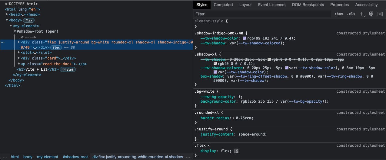
Let's run the app and go check the browser!

Beautiful!
But how does it work?
The magic keyword is "constructable stylesheets". If you haven't heard of this yet, before lit I didn't either. But here's a great blog post about how they work: constructable stylesheets.
The dev tools also help us by showing constructed stylesheet next to classes that originate from
one of these.
This way lit can use these stylesheets and reference them in the components. This means we will now
have one constructed stylesheet with all the tailwind classes that have been found in our code which
gets referenced in every component where we add it to the static styles property. Neat!